


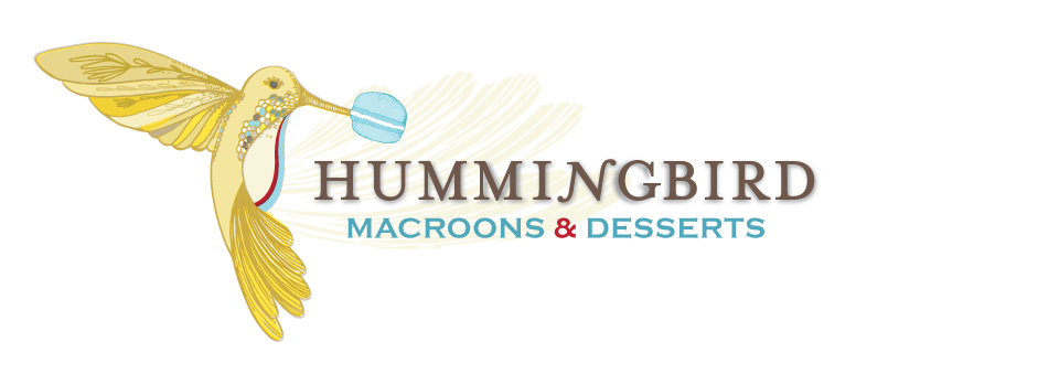


Client: Humming Bird Macaron | Work Process: Client reached out to the studio for an updated version of their logo. I researched around french bakeries and pastry shops. Just gathering ideas, this is considered an Illustrated style logo. Client was very specific on the humming bird sticking it’s beack into the macaron. A metaphoric concept in the juice of life. Mrs Eaves was the typeface I went with, altering the letter N in the word. Custom illustrations were also created and turned into a pattern to be later used as fabric for the shop, such as furniture and decor covering.

I was contacted by 757 Alliance and Hampton Roads of Commerce to create an Art Map, that will further their branding efforts for the https://www.757recovery.com. After a few rounds I was chosen from list of creatives in the area, I’m happy and super grateful of their choice to go with @butterpop_art.
I had artistic liberty on this project, which made the process ever so much more smoother. The following is the Final Map which will be presented to 5000 Businesses in Hampton Roads. I created collection of about 50 icons in the collection. All done in procreate and photoshop. This made post production for the website a lot easier to execute. The programmer and animator easily transitioned the files into the final website and power-point presentation.
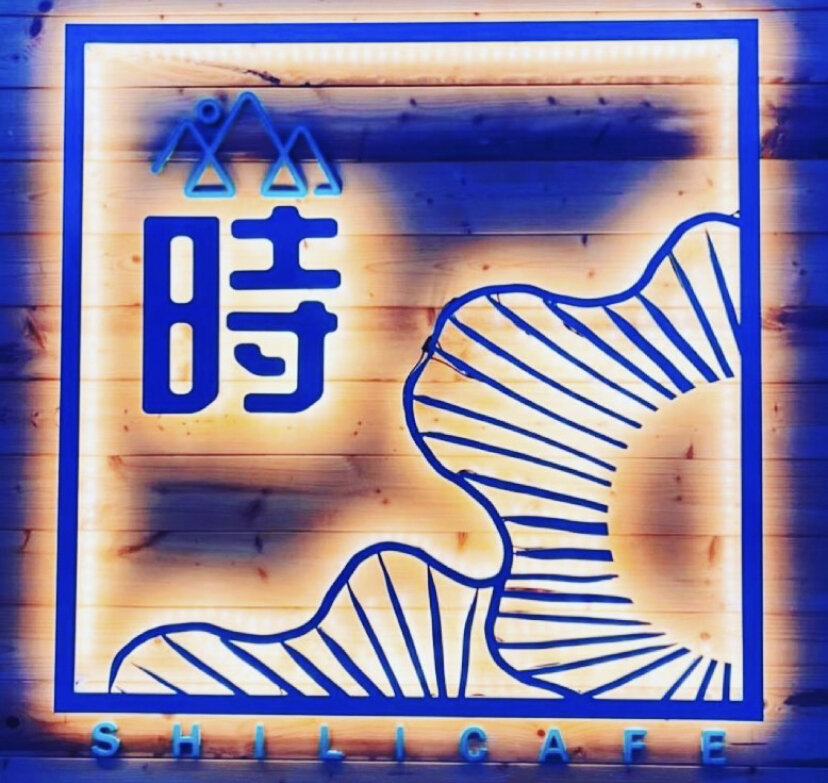
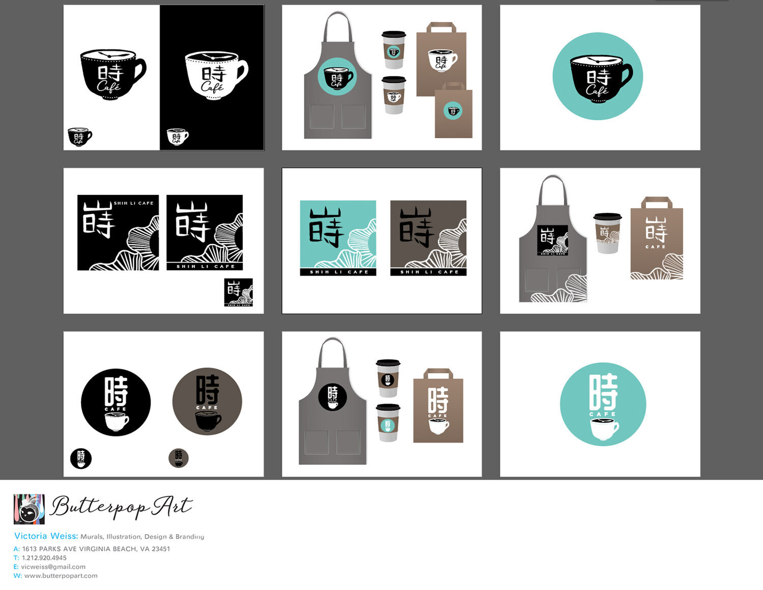
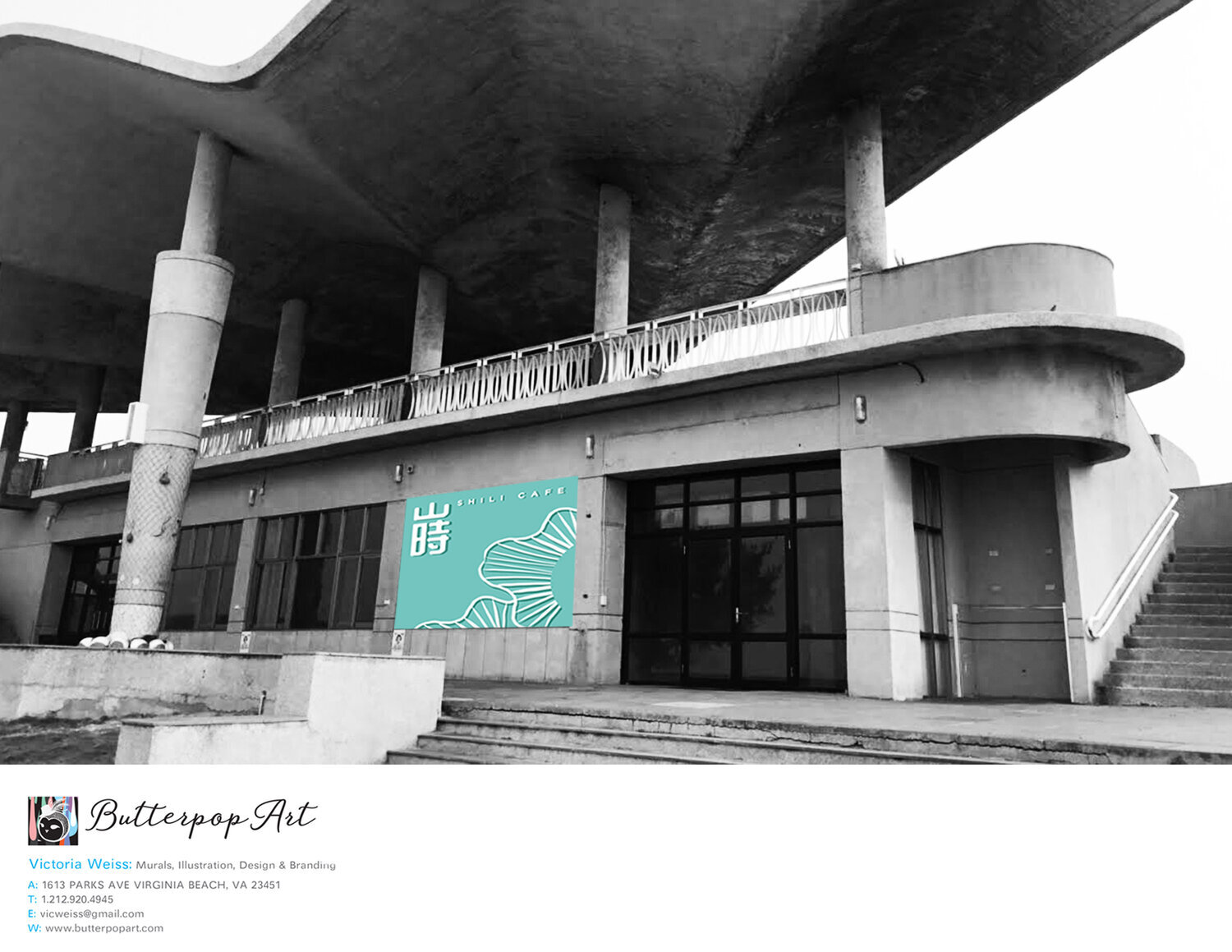

Landed a Coffee shop logo and branding gig after COVID lock down. This coffee shop was located in island off Taipei called Pung Hu it’s right by the ocean. The building structure rooftop was shaped like corals and all concrete. So it made sense to incorporate the hand drawn coral shapes then vectorized to form the logo with the Chinese character Translated and called “Time.” The colors of the sign is more turquoise in the day and changes to this blue at night. I went through quite a few rounds with the board of directors. Bi-lingual mandarin helped. It was interesting that a range of ages on the board determined final out come. Just because the older generation wanted more the character to come out and less illustrative elements. The younger perspectives loved the coral illustration. I try to find a balance of two in-order to make it work. I thought about Charles Machintosh, the architect. How he designed these beautiful simple organic sillous in squares while I was sketching initial designs. I thought about nature, the sea, being inspired in this coffee shop when one steps in to feel an new local experience.. All the things.. The coffee shop is open and absolutely stunning. More photos to come.
AD AGENCY WORK :
2019, I was the Senior Art Director and Designer at DAVIS AD AGENCY in Virginia Beach. Davis is a full service Ad Agency with a wide client base such as hospitality industry, fine dining, hotels, law, real estate development, car dealerships, retail, medical, appliances, government, military, local businesses, non profits, education etc. Highlights include a new logo and brand for a Japanese Rooftop Garden Restaurant called Orion on top of the New Marriot in Virginia Beach. Also Gerald’s Ice Cream Shop!
ORION’S ROOF BRANDING PROPOSAL IDEAS | DAVIS AD AGENCY | VIRGINIA BEACH

AD AGENCY WORK | ORIONS ROOF, JAPANESE RESTAURANT ON TOP OF THE MARRIOT

Client: Orion’s Roof | Fine dining Japanese Restaurant Work Process: Client wanted the word the word Orion to have the O as the emphasis of the Final Identity Design. A lot of options were explored. In old Japanese culture, retail shops, restaurants and businesses, often have a visual illustrated crest in either a circle, square or triangle. Depicting plants, nature, animations, kanji as metaphors and meaning to the family business. They are mounted as signs on top of the shop. I thought about creating a symbol that embodied either a wave or fish tale inside of the letter O. I thought about how it can easily translate to napkins, menus, websites, social media, retail products etc. The brand colors are inspired from the sunsets in Virginia Beach. They sometimes have a copper glow merging into the pink and purple skies. The lines inside of the logo also mimics the Interior Design in the restaurant.


TACO BELL: Contracted out Butterpop Art to create mural decal for their new location at oceanfront Virginia Beach. Currently in process, inquire within for more detailed project scope.

ART COLLECTIVE: Promotional, Logo Design, Event Planning, Print and Promotion.

BRAND DEV/WEB DESIGN: Accounting Services, Virginia Beach: Logo/Brand/Web Design Services
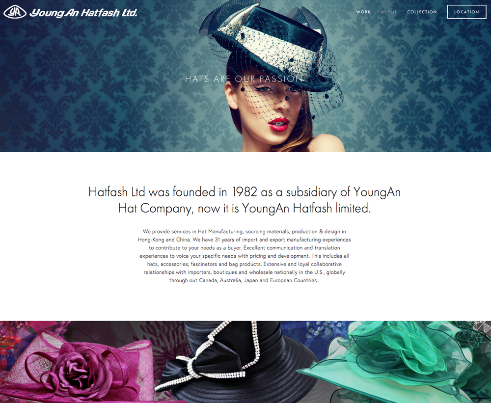
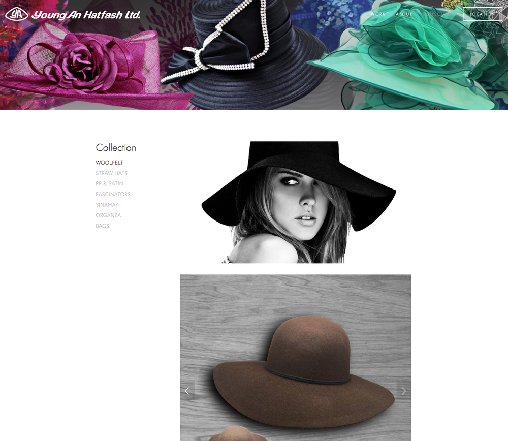
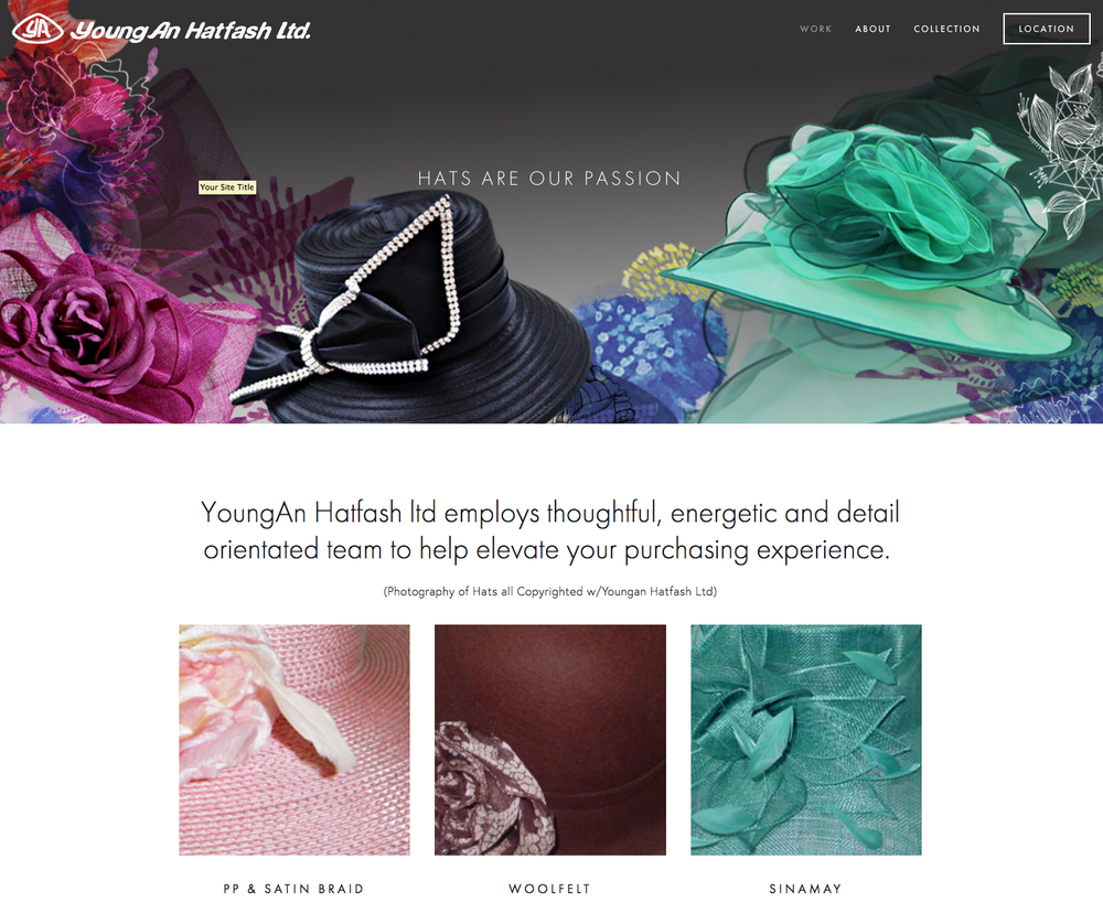
BRAND DEV/WEB DESIGN: YoungAn Hatfash LTD: Brand new site, and brand of companies merging, art direction, photoshop, digital art work, research, design and fast turn around for site launch with Butterpop Art

RESTAURANT AD: Vector heavy ad illustration, nostalgic typography treatment to give the feeling of Parisian life style.


SELF PROMOTIONAL: Butterpop ART: Studio stickers as promotional products for tradeshows, pops ups and meetings..
DIGITAL EDITORIAL ART: Digital Book Cover Design, Combing illustration, vector and typography..

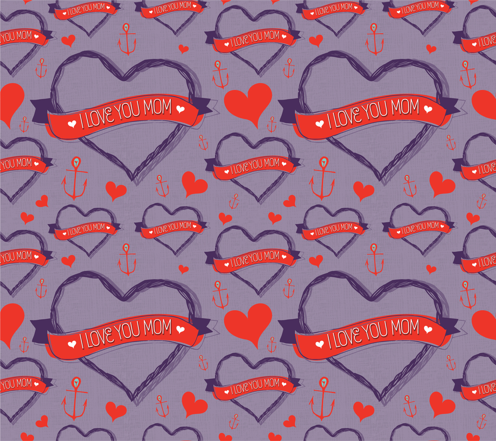
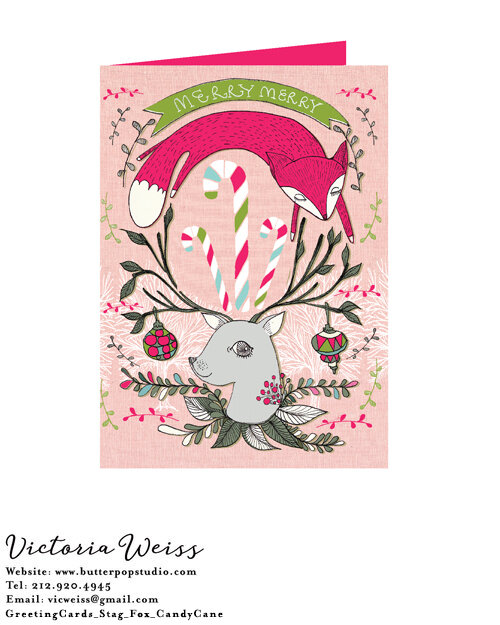
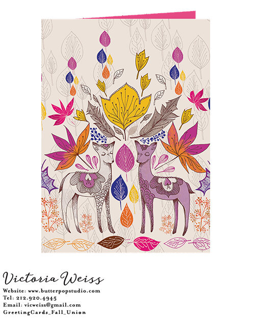
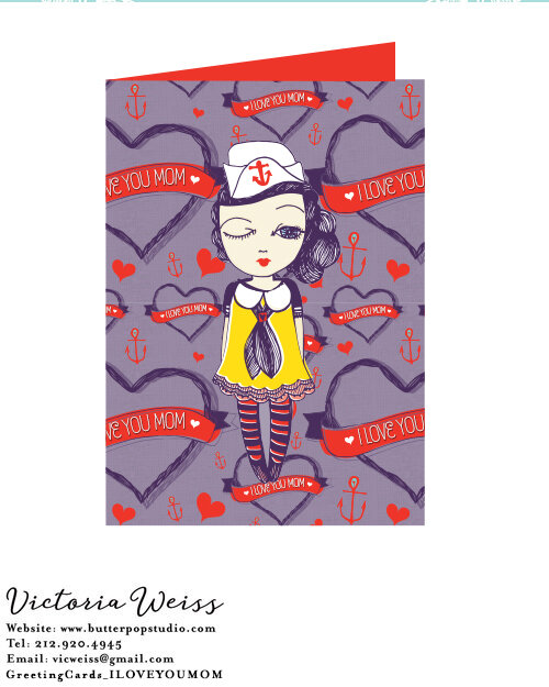
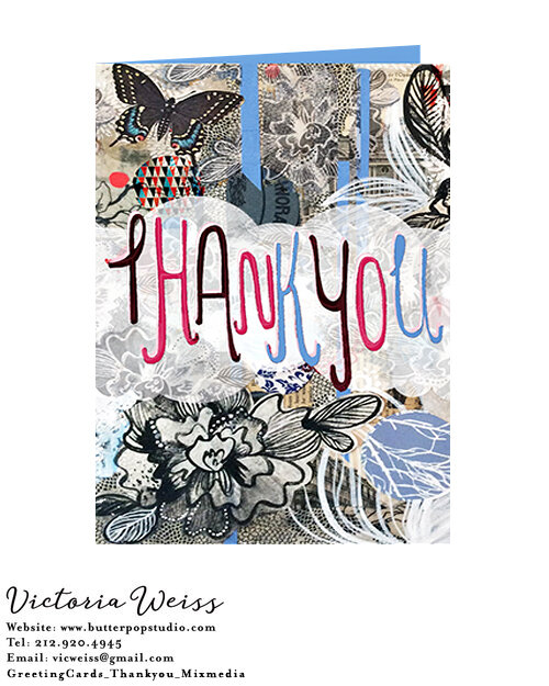
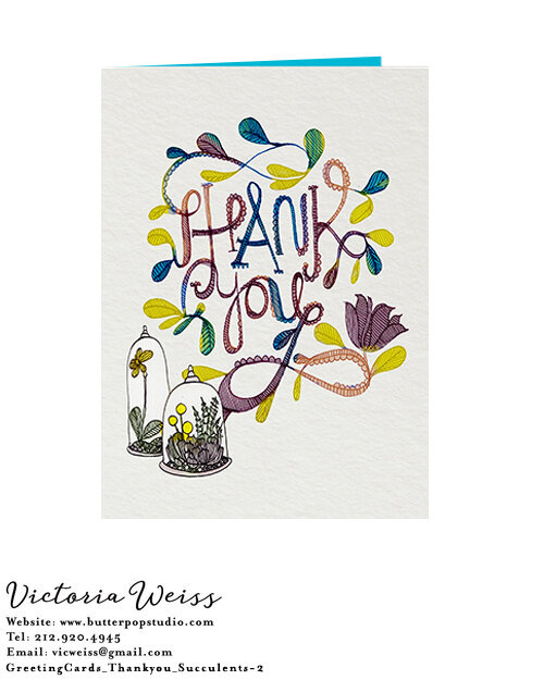
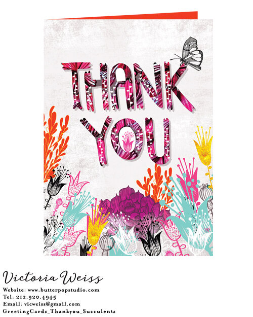
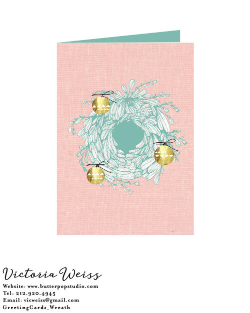
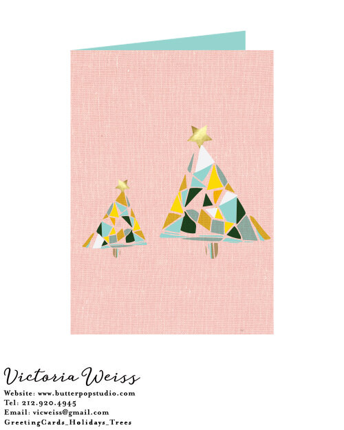
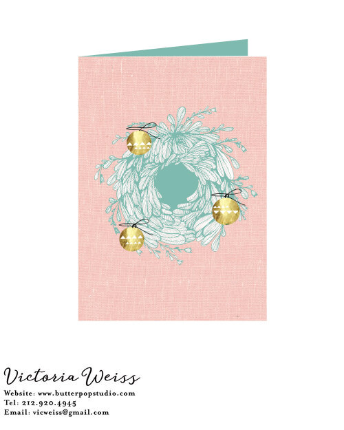
LICENSING: Greeting Card Design, Patten Samples: To sell online, local shops, and pop ups/shows..
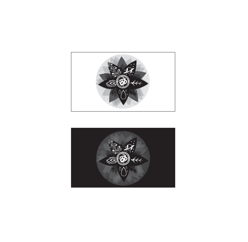
LOGO, PROPOSALS: Logo rebrand proposal ideas from color options, textural, graphic, painterly, and line vector samples.

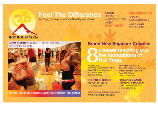
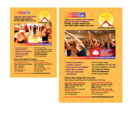
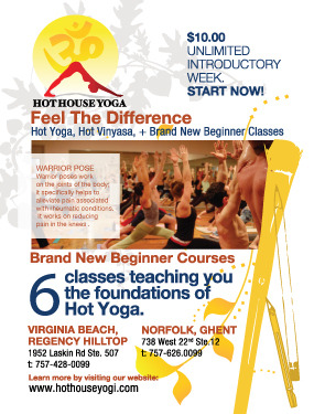
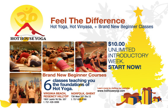
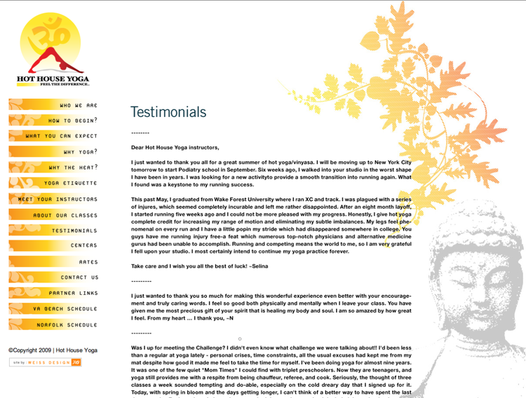
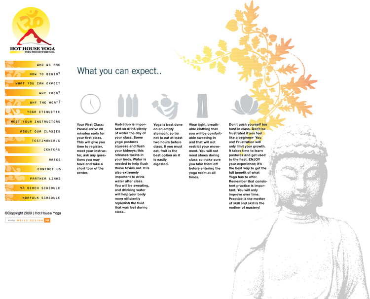
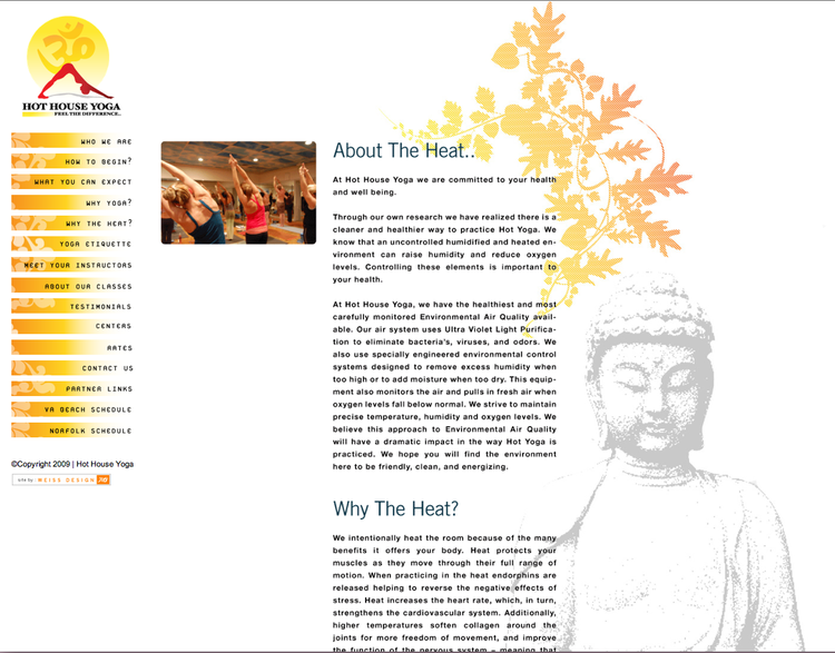
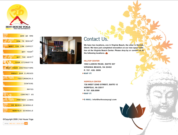
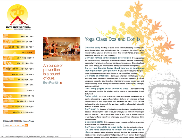
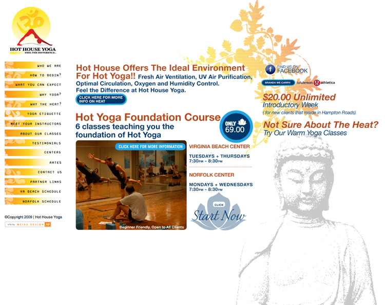
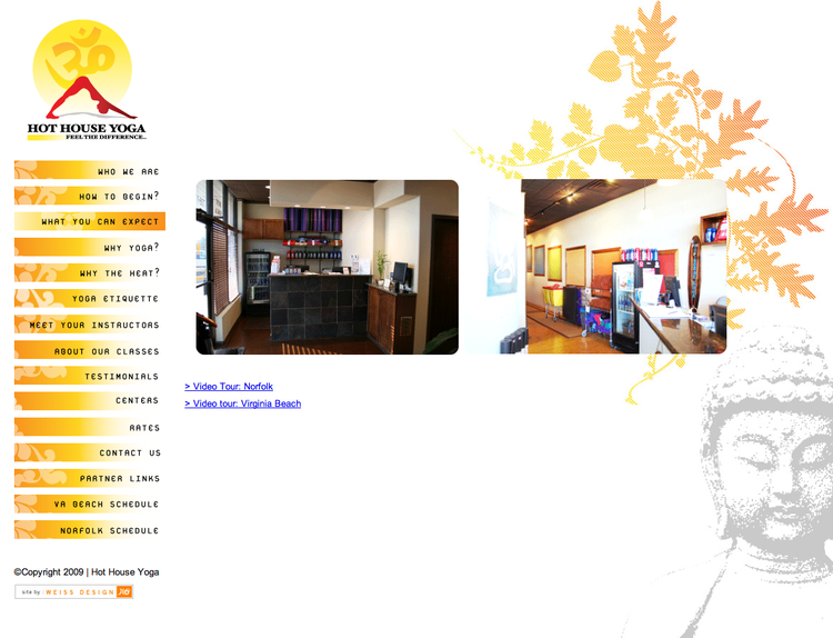
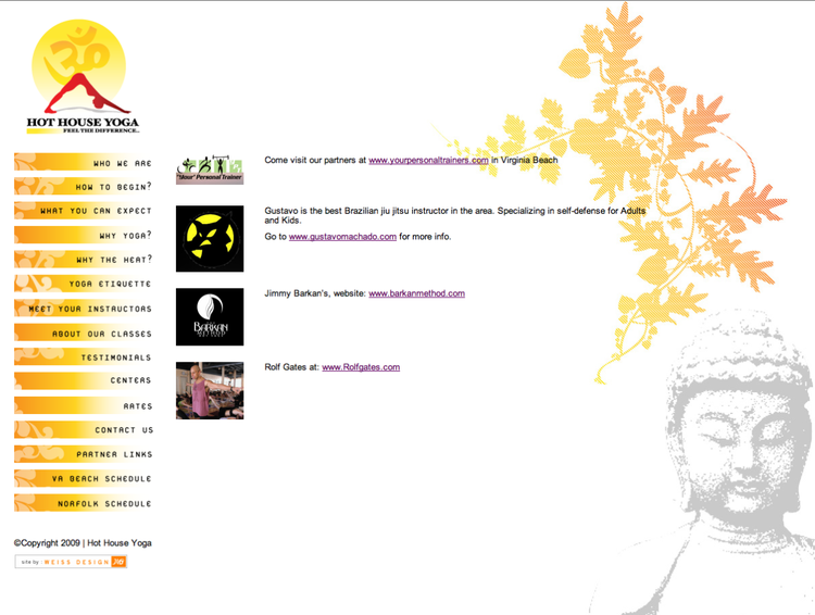
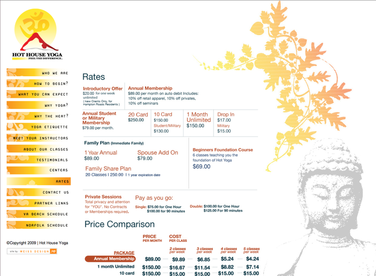
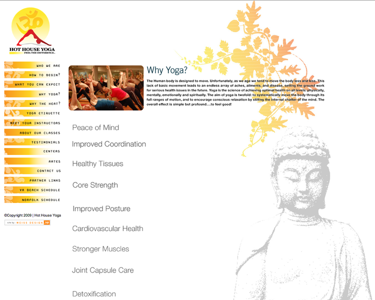
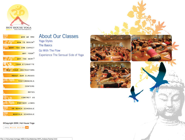
BRAND DEV/WEB DESIGN: Local Yoga Studio: Hot House Yoga Ad Samples, Website, Design and Branding


PROMOTIONAL: Studio Self Promotional Illustration and Design Calendar Package:

Studio Calendar / Promotional

Studio Calendar / Promotional
NON PROFIT: LGBT Reel it out Festival, Norfolk Virginia. Illustration, Logo, Layout, New Brand Development.

LICENSING: Contest and Licensing Proposal for Stationery Markets.
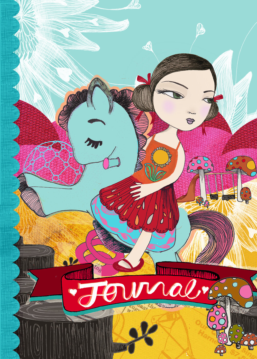
Title: Play, Journal Cover, Analog Illustration, Finalized Digitally
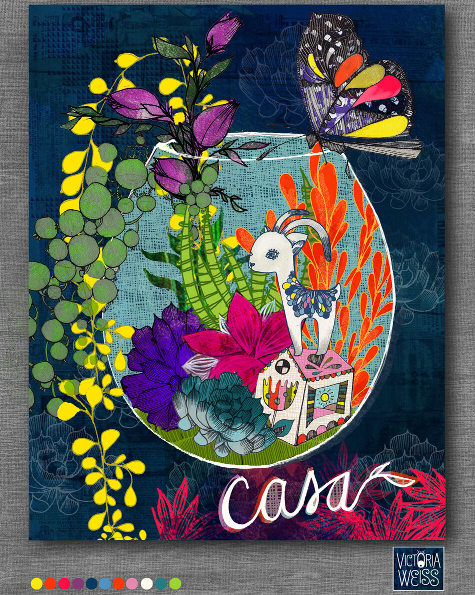
Title: Casa, Journal Cover, Analog Illustration, Finalized Digitally

Title: The little things, Design and Illustration on Products. Analogue Illustration Finalized Digitally..

Title: The little things, Design and Illustration on Products. Analogue Illustration Finalized Digitally..

Title: Farmers Market, Design and Illustration on Products. Analogue Illustration and Finalized Digitally.
LOGO: Non-Profit Work: Logo brand to t-shirts, swag items.
AIGA, LOCAL DESIGN CHAPTER: Monthly events, volunteer design work..

LOGO: Import and export Hat Company: Logo, Design, Branding, Monthly Newsletter Ads, Facebook Page, Website. (Company went through 2 rounds of rebrand both with Butterpop Art)


AD WORK: Hat Promotion


FOOD RETAIL: Yogurt Shop, Lyhnnhaven Mall, Virginia : Logo, Design and Retail Branding.
FOOD RETAIL: Gusto Pizza Shop, Wanchai Kowloon Hong Kong: Logo, Design and Retail Branding.


COMPLEX INVITE DESIGN: Evening Awards Concept Event: Wanchai Kowloon Hong Kong: Logo, Design, Greeting Card..

Independent Film Logo Proposals, Hong Kong
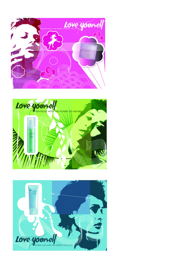
Love yourself Cosmetic Campaign, Hong Kong
Personal Blog Design/Brand

Independent Film Company: DNA FILMS, Logo, business card design. Printed in gold foil, uv matte black paper, Hong Kong..